Data Analysis in AppControl Manager
AppControl Manager can analyze the App Control for Business (Code Integrity) and AppLocker data from Event Logs or Microsoft Defender for Endpoint (MDE) Advanced Hunting. This feature is available in the Event Logs Policy Creation and MDE Advanced Hunting pages. All of the data are localized so you can change the language in the app's settings page in order to view the data in your own language.
Data Summary
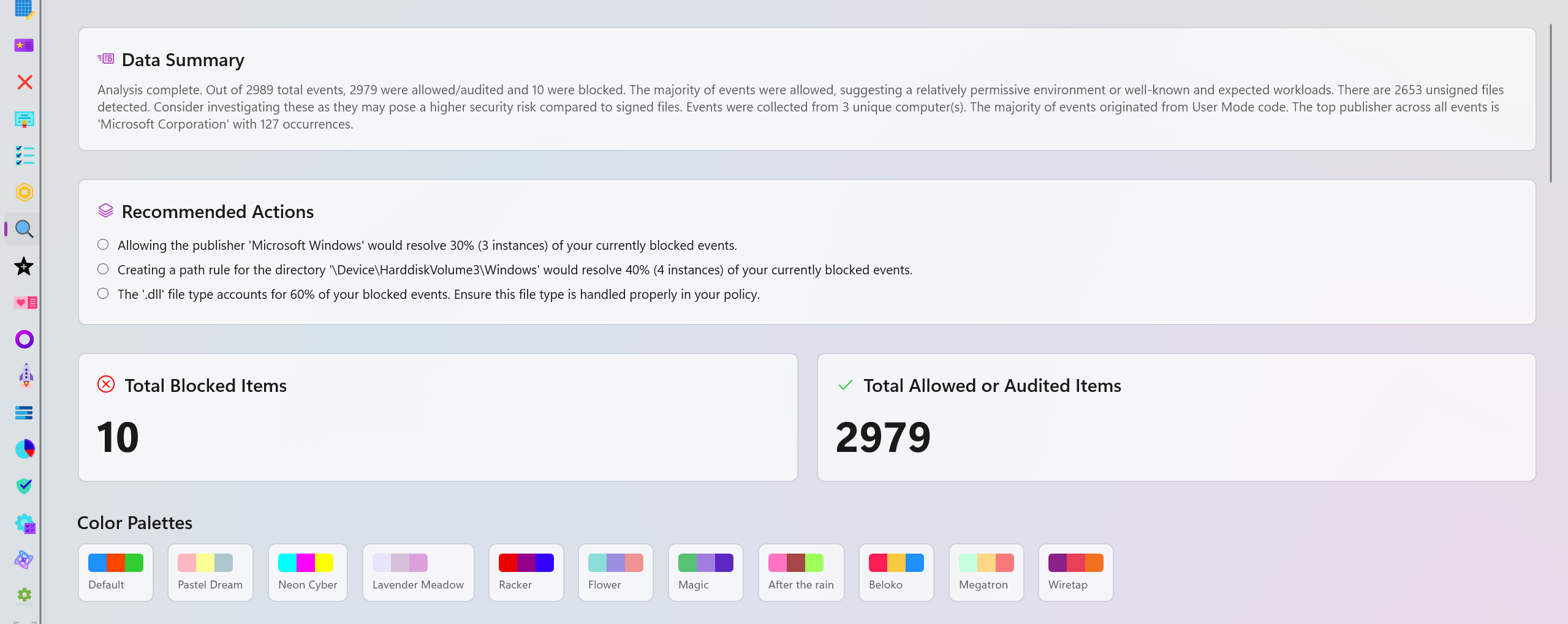
A brief overview of the available data and what they mean. It points out edge cases, provides easy to understand comparison of different data points and explains how the data is distributed in different categories.
Recommended Actions
This section will provide you with one or more recommendations based on your data. For instance, it can suggest specific policies to be deployed to resolve blocked items or recommend you to review certain parts of the logs because an excessive amount of blocked or audited events were detected in a short period of time.
Time Range Filtering
The analysis pages include a Time range selector at the top of the page so you can quickly narrow the entire analysis to the period that matters most. You can view the entire data set with All time (entire range) or focus on recent activity with choices such as Past 1 hour, Past 12 hours, Past 24 hours, Past week, Past month, Past 6 months, and Past year. When a range is selected, AppControl Manager recalculates the summary, recommendations, totals, charts, global metrics, and the audited/blocked insight categories for that time frame.
This is useful when you want to answer questions such as what changed in the last hour, which devices generated the newest blocks, whether a policy update caused a sudden spike, or whether the current activity is different from the long term baseline. During recalculation, the page displays a progress indicator and temporarily reduces interaction with the analysis content so the user can see that the data is being refreshed.
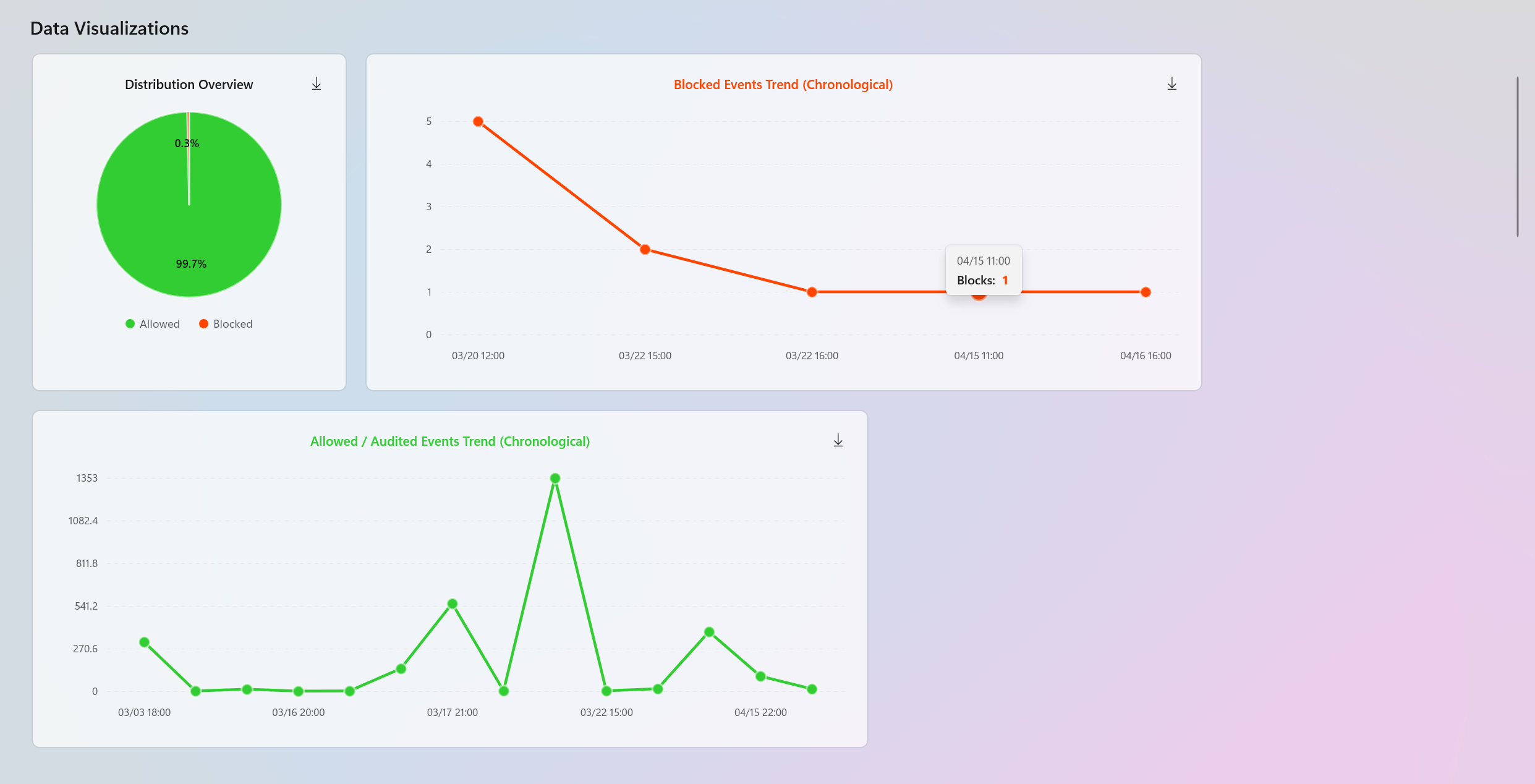
Interactive Events Trend Chart
AppControl Manager includes an interactive Events Trend chart that displays blocked and allowed/audited events together in one chronological view. This makes it easier to compare both outcomes side by side, detect spikes, identify quiet periods, and understand whether blocks and audits are happening at the same time or in different windows.
The chart supports the following features:
- Combined or focused view: Use Both, Blocked, or Allowed to show both series together or focus on one event type at a time.
- Adaptive aggregation: The chart automatically groups raw events into sensible buckets such as seconds, minutes, hours, days, weeks, months, quarters, or years based on the visible zoom range. This keeps the chart readable even when the data set is large.
- Hover inspection: Moving the pointer over the chart shows a crosshair, markers, the exact time, event counts, and compact details such as top files and top computers for the selected bucket.
- Zoom controls: Use the zoom in and zoom out buttons, the mouse wheel, or touch gestures to inspect dense areas of activity more closely.
- Pan support: Drag the chart horizontally to move across the timeline while staying at the current zoom level.
- Reset: Use Reset to return to the full available time range.
- Persistent chart state: The chart can remember the current zoom level, selected display mode, and active range selection for the page, which helps preserve context while navigating.
- SVG export: Use the download button on the chart to save the current chart view as an SVG file.
Important
The most important feature is range selection. Click Select range to create a highlighted time range over the chart. The range starts in the middle of the currently visible chart, and you can resize it by dragging the left or right handle or move the entire selected region by dragging the highlighted area. When the range is applied, AppControl Manager switches the analysis to Custom, recalculates the analysis data, and filters the original ListView data on the main policy creation page to the same selected time period.
This means the chart is not only a visualization. It is also an interactive filter for policy creation. You can find a spike in blocked events, select exactly that time window, and then go back to the main Event Logs or MDE Advanced Hunting page to view the ListView with the updated filtered data. From there, you can inspect the exact file identities that occurred in that range, delete unwanted rows, copy rows, export the filtered data, or create a policy from only the relevant events.
Use Clear range to remove the custom chart range and return the analysis and ListView data to the full selected data set. If a range is still active after zooming or panning, the button changes to Reapply Range so you can apply the currently selected range again when you are ready. This prevents expensive recalculation during every zoom movement while still giving precise control over when the analysis should refresh.
Temporal Polar Chart
The new Event Activity Pattern polar chart provides another way to understand when events happen. Instead of showing events on a straight timeline, it groups activity around a circular chart so recurring patterns are easier to spot. This is useful for identifying whether blocked or audited events are concentrated during certain hours, months, or days of the week.
The polar chart supports the following display modes:
- Hourly: Uses 24 sectors, one for each hour of the day. This helps identify activity that repeatedly happens at specific times, such as startup, sign in, scheduled tasks, or maintenance windows.
- Monthly: Uses 12 sectors, one for each month. This helps compare activity across the year and identify seasonal or long running changes.
- Day of week: Uses 7 sectors, one for each weekday. This helps identify whether activity is concentrated during weekdays, weekends, or a specific day.
The chart shows blocked and allowed/audited data as separate colored shapes with a legend that includes the total count for each series. The farther a shape extends toward the outside ring in a sector, the higher the activity for that period. This makes it easy to compare event density between blocked and allowed/audited activity without reading individual rows.
The polar chart respects the currently selected analysis range. If you use the interactive trend chart to select a custom range, the polar chart updates to summarize only the events inside that selected range. This makes it useful for answering focused questions such as which hours were active during an incident, which weekdays were affected by a policy change, or whether a selected spike was isolated to one period or spread across multiple buckets.
The chart also includes hover tooltips for each shape so you can inspect the count distribution for each sector. If no activity exists for the selected data set or time range, the chart displays a clear empty state instead of showing a misleading graph. You can also download the current polar chart view as an SVG file for reports, documentation, or offline review.
Export to PDF
The analysis pages include an Export PDF button in the top control area next to the time range selector. This lets you save the current analysis page as a PDF document after choosing the output path. The Event Logs analysis page exports to Event_Logs_Analysis.pdf by default, and the MDE Advanced Hunting analysis page exports to MDE_Advanced_Hunting_Analysis.pdf by default. You can choose a different name and location for the exported file.
The PDF export captures the visible analysis content, including the data summary, recommended actions, totals, colorized charts, global security metrics, and the blocked and allowed/audited insight sections. It captures the page content section by section so the exported report keeps the same visual organization as the in-app analysis. The exporter renders content at a high scale, flattens transparency onto the current page background, crops horizontal background-only margins, compresses the images, and writes them into a PDF 2.0 document with PDF/A-4 metadata and an embedded sRGB profile.
While the report is being generated, AppControl Manager displays a Generating PDF progress indicator so the user knows the export is in progress. The export uses the currently displayed analysis. This means if the time range selector is set to a recent period or the interactive chart has applied a custom range, the PDF represents that filtered view.
Tip
This is useful for creating focused reports for incident review, policy tuning, change validation, or sharing the exact state of the analysis with another administrator or team member. You can also use the PDF export to create a snapshot of the analysis for offline review or archiving.
There is also a Pie chart displaying the distribution overview of the entire data set.
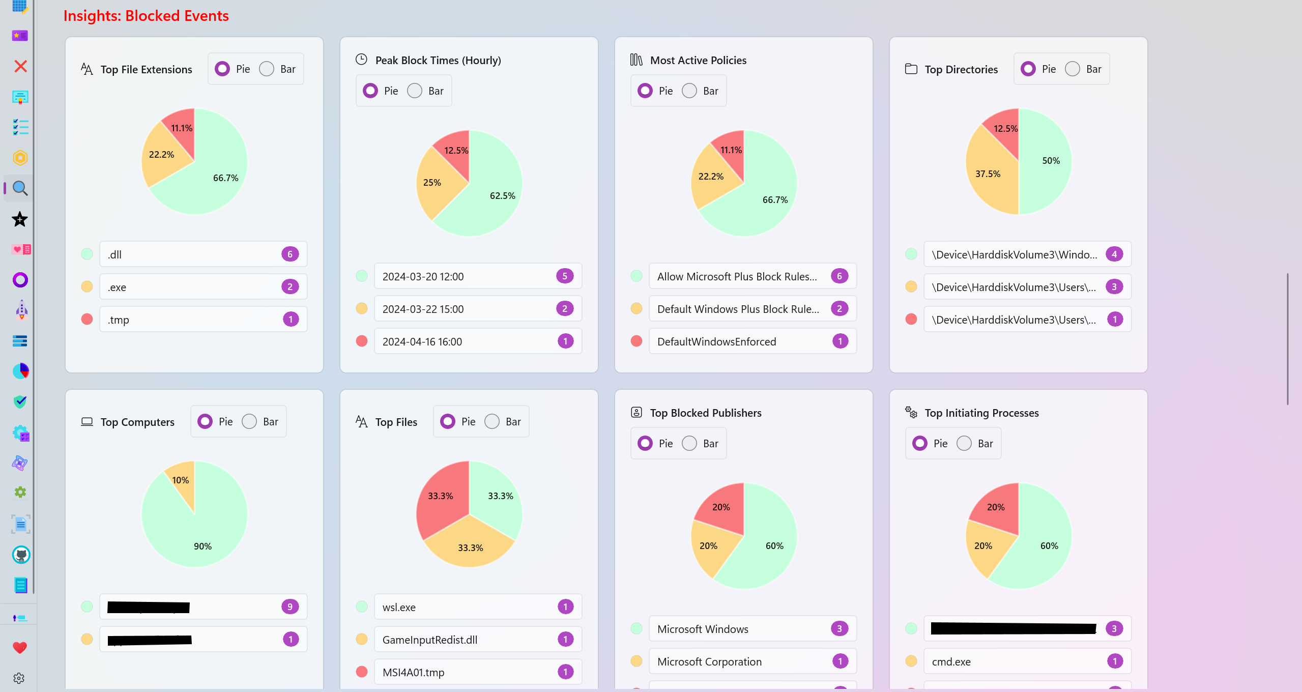
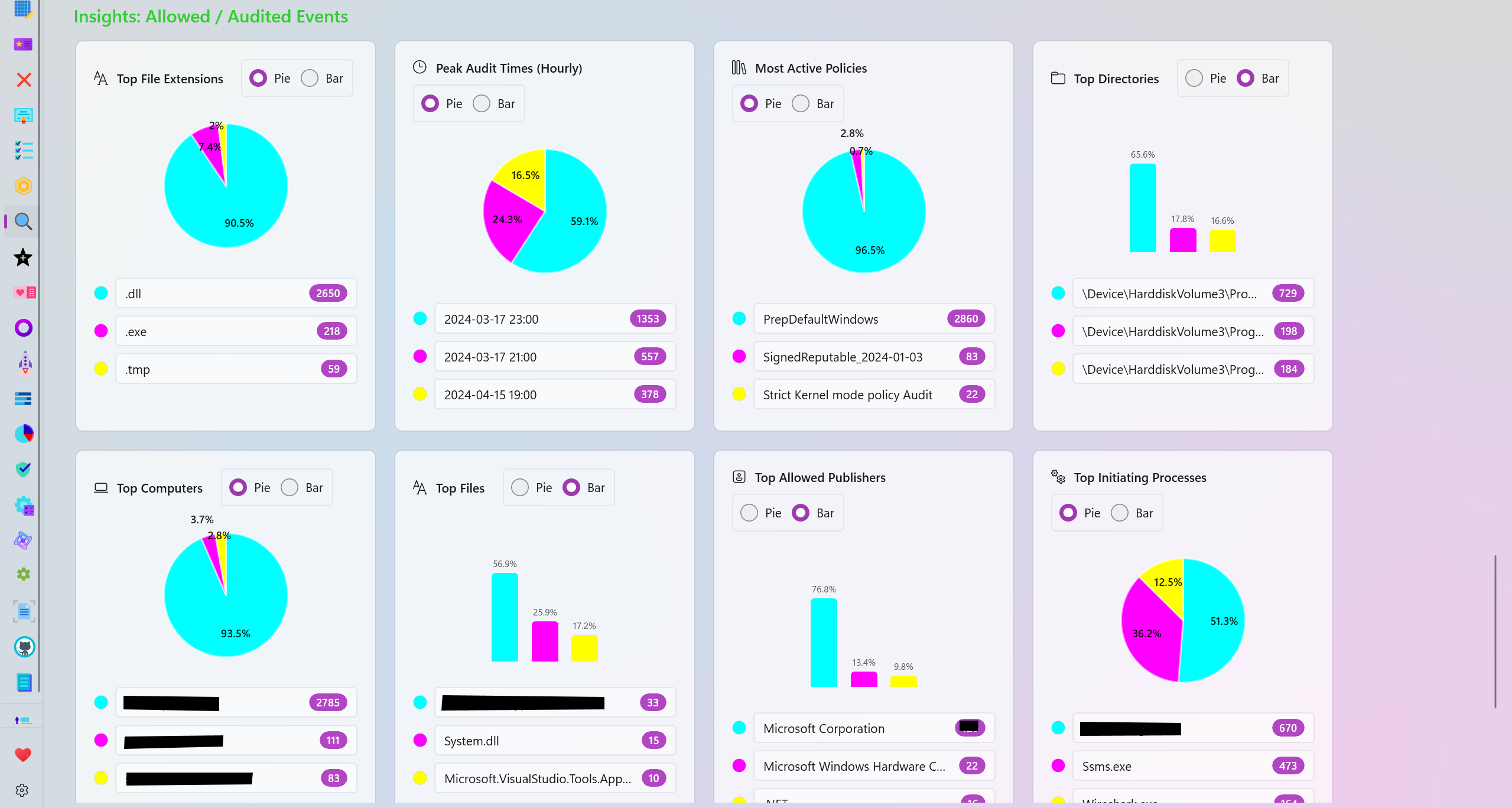
Audited and Blocked Insights
The analysis page generates many categories based on your data for further visualization of the blocked or allowed/audited data.
- Top File Extensions: View the top file extensions that were blocked or audited.
- Peak Block/Audit Times (Hourly): View the time frames where the most blocked or audited logs were generated.
- Most Active Policies: View the top most active policies responsible for generating the most blocked or audited logs.
- Top Directories: View the top directories where the most audited or blocked logs originate from.
- Top Computers: View the names of the top computers/systems that generated the most blocked or audited logs.
- Top Files: View the names of the top files that were blocked or audited the most.
- Top Publishers: View the names of the top file/program publishers that were audited or blocked the most.
- Top Initiating Processes: View the names of the processes that the most blocked or audited logs were initiated from.
- Top packaged Apps: View the top Package Family Names (PFNs) that were blocked or audited.
- Signing Scenario: View the distribution overview of the Signed vs Unsigned files among the blocked or audited logs.
Personalization
There are multiple color palettes to choose from in order to personalize the charts available in the analysis page. Each slice of a pie or each part of a bar chart can also be individually colorized to meet your needs.
Feedback
If you have any feedback or suggestions, please don't hesitate to create a new issue or discussion on this GitHub repository.